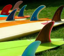
Back with more classic logos which I had overlooked first time, plus some sent in by Henry. Above the parrot on Henry's early 70s Tiki pig, a very unique logo. Birds seem to feature on lots of surf logos. May be something about a bird's freedom and grace which connects with the act of surfing a wave. Or thats what we'd like to think

The early Tris logo, early 70s when his address was Porthtowan, not the later Mount Hawke.

Cosmic lettering from Martin Geary's first label

The Freedom power turn logo, mid 70s

Rare OM logo from the mid 70s McAllum/Semmens days, on a singlefin stinger.

Which by the early 80s had been refined to one of the best logos of the era.

A somewhat unreadable logo at first glance -Tig surfboards by Tigger Newling from 1970.

This is the first Bilbo diamond logo, with the earlier slanted writing, from '65/'66, on one of Henry's longboards. U.S. Walker foam was used on quite a few Bilbos at this time.

Another cool drawing I think by Keith Flack , who also did the iconic Tris logo. This one is for Chris Jones' Newquay label Alias, early 70s.

Henry's Conway singlefin shows the unusual logo placement John gave his boards, often near the tail. Feels a bit more artful.
 Back with more classic logos which I had overlooked first time, plus some sent in by Henry. Above the parrot on Henry's early 70s Tiki pig, a very unique logo. Birds seem to feature on lots of surf logos. May be something about a bird's freedom and grace which connects with the act of surfing a wave. Or thats what we'd like to think
 The early Tris logo, early 70s when his address was Porthtowan, not the later Mount Hawke.
 Cosmic lettering from Martin Geary's first label
 The Freedom power turn logo, mid 70s
 Rare OM logo from the mid 70s McAllum/Semmens days, on a singlefin stinger.
 Which by the early 80s had been refined to one of the best logos of the era.


Amazing
ReplyDelete