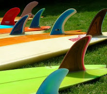
Following on from the strange tails post from last week with the twin pin, here's a design Alex saw recently on the north shore made by Daniel Nichols.
' I met Daniel on the North Shore last year at Rocky point, he was surfing the red Bolt in the pics on the day we met and of course I was interested in the Lightning Bolt as you don't see many around, plus it was epoxy and very light. Daniel shaped for Bolt back in the 70s so I presume he can still use that logo on his boards, so it was interesting talking to him. Next day he was out in the water with his yellow fish with the fins on the tail, so I got a shot of it. Something Daniel had been playing with, he then sent me some shots of the next bunch he shaped.'
Tuesday, 30 November 2010
new home
Some of the collection has just moved into a new home. What was once a tumbledown outside toilet, has been done up by my mate Tim in return for a painting or two. A good trade I think , and a winner for both sides. Altough its quite a small space 25 + boards can fit in without fins. And lets face it the boards look better than a stinky old dunny.
Monday, 29 November 2010
Newquay -various bits
A few mixed bits with a Newquay connection. I found these three framed prints a few years ago at a car boot. Taken by Doug Wilson, one of the founders of Bilbo and the manager of the Bilbo shop in Newquay, in around 1965 on a promotional trip to France. The prints were sold at the Bilbo shop in '66 or '67, and I think the frames came with them as there are some identical ones at Bilbo's stand at the Boat show of '67. I worked out that the guy above is Dennis White from Sydney, and below is Jim Noll, Greg Noll's brother. If these prints hadn't been framed they would have been trashed by now.
Jim Noll in same yellow shorts, Dennis white with blue t shirt and Rod Sumpter looking at camera, La Barre 1965, probably same session.
Thursday, 25 November 2010
Great British logos
Logos on vintage boards are a work of art on a work of art. They go hand in hand to make looking at vintage boards a pleasure as well as surfing them. Here are what I think are the best of the bunch, in no particular order; I'm sure I've missed some beauties out so if anyone's got something to add email me. I've got a bit of a habit of collecting things with logos or nice graphics on, and surfboards just have a massive range from the sublime to the ridiculous. They showed what we dreamt of, where we hung out and what crew we belonged to.
This colour overlap was used quite a lot by Bilbo and looks a very cool, late 60s acid trip style.
Echoes of the Tris logo a bit, lefthanders and nipples at sunset are always going to make a pretty logo. This is actually a fave of mine, haven't seen another of these yet...
Whenever you're out surfing there's always seagulls gliding along the wave like this. I guess they're cruising for fish
A tropical dream lineup from the mid 70s, vit sea's first logo ?
Classic and slightly wierd logo from the dream team of Tigger and Tris, mid to late 70s. There's not many of these about.
A classic font from the olden days - is it wild west or fairground ? Made eyecatching with late 60s psychadelic boldness.
Its all gone bonkers with the outer limits logo - great 70s boards which pushed the boundaries of surfboard art, made by Martin Geary with the help of Fuzz Bleakley.
A pretty logo for a laid back lifestyle.Phil Jay from the very early 70s. Sold to Londoners from his capital surf shop.
Psychadelic influences in this cool logo and raspberry ripple board from swinging St Ives early 70s.
Everyone loves this logo, and why not - it perfectly transmits how great surfing can be. Artwork by Keith Flack.
Great logo from the early 80s, the age of early digital technology. Made by the man who was a genius at engineering and also put out a few boards - Bill Bailey.
Not a long lost bottle of wine, this rare gem comes from South Wales and the hands of Alan Williams in 1971. Great font which is well used today.
A classic logo, simple but with the touch of luxury - gold leaf.
Another favourite, Freedom of Jersey circa 1970, the days of free love and LSD. Made by Steve Harewood.
Talking of free love ..Skewjack got nicknamed screwjack for the promiscuous nature of its inmates. This is a big and beautiful logo from one of their boards, a scarce early 70s twin fin, surely rare as rocking horse sh1t
The classic mid 60s logging logo ,Californian style comes to Newquay.
Repetition and doubling up can make a simple logo better, as here on Alex's late 70s vit sea.
John Conway's bird , looks a bit angry. But a cool logo, would love to know the story behind it .Early 70s.
Wednesday, 24 November 2010
LB
Tuesday, 23 November 2010
Monday, 22 November 2010
Subscribe to:
Posts (Atom)